2/9/2020 by Theo Goutier
Data-blindness. Can’t we see the sea for the Covid-19 waves?
Do we run even more risk of misinterpretation in this era of Big Data and AI?
Dobilo has built up strong expertise and experience of successfully using Big Data analysis and started also on AI in the context of running your business. This expertise is on offer to you as a business, see at the end of this blog.
As a follow-on from our analogy on Covid-19, see our earlier 3 blog-episodes posted, we now pick up again today with the talk of 2nd waves hitting us. Are we looking at the whole ‘stormy sea’?
Like in business we sometimes say, ‘we can’t see the forest for the trees’. Do we then also not risk to drown in these oceans of data or are we not swimming against the tides instead of along with it?
In the second episode, we did already allude to the risk of data-blindness with the famous story of the bombers returning in WWII reinforcing the planes where they least needed it as they missed out on 'data' from the ones that did NOT return. Also, in business, we’ve seen numerous examples of data-blindness. One of our clients collected ticket-details of all of their 300 store cash points in a centralised system. That huge amount of data, however, would never tell our client how many potential customers, that would not enter their stores for various unknown reasons, might have been missed. Increasing the spend per customer is less relevant if you can get more customers even if they spend less than the average. If additional sales is what you are after you need to get that picture complete first with additional data-gathering.
It is very much like watching a tennis game on your television set through a tube of 10 cm wide. A good one that can keep his or her eye on the ball!
Random sampling is critical
Back to Covid-19. What is the data-blindness here? What one learns, if the population is exceptionally large or the size cannot be known, that you need to do random sampling. Already 30 truly random selected points will give a fairly reliable outcome.
Imagine a forest of one million trees and they would ask you to measure the average thickness of the trees. That would take far too much time to measure all of them but also an easy measuring of the first 30 trees will give you a biased outcome as they might be different on the rim of the forest. Let us show how it would work or would not work: visualise the 1.000.000 tree forest as a large square. Then let’s pretend we do know the thickness of each of these trees, but the researchers do not. So, the real average thickness we know is 79.36 cm and the minimum is 10 cm and maximum 150 cm.
From all the trees thicknesses we took 10 samples of different sizes ranging from 3 to 30000. Now if you only do 3 the chance of taking only small or only big ones is quite large. But with 30 already it becomes less of a ‘risk’ to be far off. Below graph shows the ranges found where the rectangular is the most likely range. For a sample of just 3, the range was 68-89 or 11-14% different from the real average. For 30 it is 71-78 or 2-10% off while for 30000 it is just 0.1-0.5% off or only 1.2-3.6 millimetres! You also see the bigger the sample the less it will be offset from the average (we call this bias).

In practice what is the case we might not have the resources even to do 3000 random samples. Imagine you have 8 people going into the forest which is this square; 4 go in on the corners and 4 go in on the exact middle of each side and measure the first 40 trees they encounter so we have 320 data points which seem rather okay?! Let us have a look: what they do not know, but we do, is that the forest was planted in stages and has 4 even squares of youngest, young, old and oldest trees. So, the ones on the corner measure 40 of each of this category while the people on the middle might measure 2 categories that are on either side of his entry point. Let us also state that on the edges of the forest we’ll only find the smallest ones of each category. In fact, they then will find 80 of 10, 51, 91 and 131cm thick each. The average of that sample is 70.75cm or 11% short while when truly random they should have found in 80% of the cases less than 5% difference with the real average and less biased to one side (as on the edges the trees are smaller)!

Measuring gauge
Now what and how we measure is also determining the reliability of our information from the sampled data. In the case of the trees, the 8 researchers will have normal dressmakers measuring ribbons and the instruction to measure the thickness at chest height. So we have people with different lengths and ways of measuring that could easily be a couple of centimetres off when measuring the same tree. Now the purpose of measuring the trees might not require a tight measurement error. If the owner of the forest just likes to know the tree growth-rate to predict for enough thickness (so when to harvest them), it might be more than okay to miss out a couple of centimetres. The sampling method would be much more of a potential issue if not done randomly.
What does this all mean for Covid-19?
Here we have to breakdown the issue into 3 pieces. One, the size of the infected population is not known and certainly has and will vary over days and weeks. Two, the testing has and will not be random as in the beginning only the (very) sick people, nurses and doctors were tested due to testing capacity limitations. Three, the reliability of testing is an issue. A PCR test has 66% chance of being right as it might give false negatives (virus-RNA amount needs to reach a certain threshold first) and certainly also will test positively some time after the infection already is tackled by the immune-system as it cannot distinguish between infectious and neutralised viruses (their RNA is the same). The test will be positive even for a week or longer after(!) the blue curve, below depicted, is back at 0 until the threshold of detectable RNA is reached.
Click on below image to read this interesting article explaining it all.

“ PCR detection of viruses is helpful so long as its limitations are understood; while it detects RNA in minute quantities, caution needs to be applied to the results as it often does not detect infectious virus.”
What does this say, in hindsight, about the waves of Covid-19? The first wave people were barely tested. In some countries, even people were counted as Covid-19 patients or deaths without any test. Belgium is a ‘nice’ example. The testing was far from random and far from accurate beyond the intrinsic accuracy. A good way of estimating the real infected number of people should come from other sources like blood sampling like they did in the Netherlands. People giving blood (close to random?) were tested on antibodies and they found back in April 2020 5-6% has had the disease. The testing on (suspected) patients for the same period was 15% positive. That indicates that most likely 5-15 times more people had been infected but maybe were not getting sick nor reported themselves as such at that particular time. Also, other research points strongly that way. Based on the (low) testing efficiency Belgium is estimated to have had half a million people infected back in May or 10 times more than officially diagnosed!

Courtesy of Bisnode (article on their website)
Furthermore, we have to distinguish also the waves w.r.t. the number of people infected versus the number of people hospitalised or deceased. In the latter case, we know from statistics on excess deaths in Belgium and Netherlands that people respectively were most likely easily marked as Covid-19-deaths or the other way around (see episode 1).
Two graphs to illustrate the wave differences. First, the deaths versus cases found by day. Second, the case rate per head of the entire population of Belgium.

The reported cases are clearly beyond the second ‘wave’ and deaths, fortunately, are way less (no second wave).
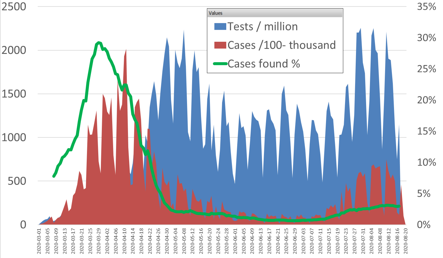
As of mid-April testing was bumped up in Belgium and then the case rate (green line) steeply dropped. The wave in July seems to be caused primarily by more testing again too. Both trends we see in most countries around the world. Still, we are not testing randomly, as people might be more or less encouraged or motivated to be tested, even when sick, so right now there might be 2-4x more people that are or were infected.
Learnings for your business?
How to properly start your data analysis to avoid data-blindness? What is it that you want to have better understood and is the measurement you intend to set up adequate:
0) Are you able to get all of the needed data?
Scoping is important. As we found out that for measuring the order entry speed at one of our customer's Customer Service department a small but not negligible portion of orders sent in by email was stuck in CS-reps email-boxes for hours sometimes days. Just measuring confirmation and entry timestamps in their system thus was not showing the whole picture.
1) Can I measure (obtain) all instances of the population or should I go to sampling?
This depends on what your IT really captures. Certain questions require additional data that needs to be collected differently (even manually) beforehand or further down your analysis when the system-data indicates a phenomenon that is not recorded by it (yet). For instance, with understanding transport rates the system might just have the total amount payable and not the breakdown so that accessorial charges for fuel, special handling etc. are diluting your targeted information for bare rates.
2) Map what your system is recording in straight sequential steps thus assuming things go right the first time.
This way you will better see what your IT system is capturing and what not and also shows how good your first-time-right ratio is. Best not to focus on side steps in the process or backtracking as they are usually the exception!
3) Always good to gauge your measurement system too.
Take a random sample of 30 and check f.i. the real ‘paper’ invoices and determine how much of the data in the system has errors against them. If you find 1 or more major differences, usually typo’s than do another sample. If still differences are found it tells you to tighten the entry methods first and attempt to ‘repair’ the data set for these differences in a fair and representative way. For instance, if the year 2091 was entered then it is safe enough to assume 2019 was the year meant. With 1900 do not make the guess but try to logically reconstruct from other date stamps.
Dobilo challenges you to send us a large data set (system-dump from your BI tool). Tell us then what you want to be analysed for us to report back on. We'll show you the issues you might encounter with the information to be gained from that data set versus your objective i.e. question.