11/7/2020 by Theo Goutier
Does Big Data equal Good Info? Episode 3 of 3
An analogy of the Dobilo approach in businesses using Covid-19 worldwide available data
In this final episode we'll show how we as Dobilo use BIG data by trying, and as we are no experts on epidemiology no more than that, to now see what factors could be driving Covid-19 mortality rates.
First a small recap. In Episode 1 we've shown that any Big Data set needs first to be understood in its scope, structure, data sources and above all potential flaws and omissions in the measurements done. Usually, differences are stemming from entities operating such as countries, cities, locations, departments and even individuals. Preferably this is done by checking with other data from different sources or (new) measurements (gauging).
In Episode 2 we've explored these contradictions found and zoomed in to understand if we see a true shift in a 'performance' indicators (KPI) value. Thus we have to be careful not to make swift conclusions about the particular overall KPI.
A few years ago, we were asked by a large transport company to assess the waiting times of their trucks at various Distribution Centers (DC's) in Europe of a well-known price-fighter retailer. Waiting time at DC's is usually compensated when more than 2 hours (120min) in duration. In its essence, this is pure waste and thus to be avoided or even better to be eliminated. The company wanted to understand how many times and how long trucks were waiting beyond 2 hours. The overall data initially showed 15% of arrivals lasted longer than 120min (up to 400min). However, this data proved to be distorted, although captured in the same system.
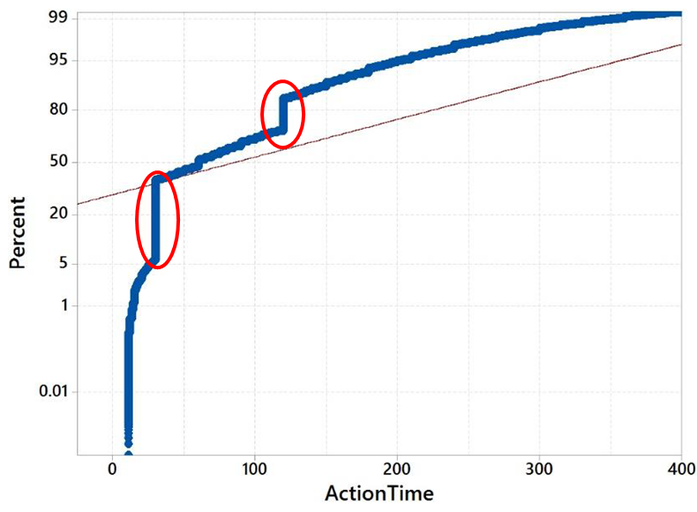
The two straight 'lines', actually strings of single data-points, we found out were caused by trucks subcontracted not using their board computers to capture 'exact' arrival and departure times. From zooming in, we found out that admins then entered rounded times per 30min usually while also certain country departments entered 120min regardless of the real recorded time for all their subcontractors!
In reality, more than 20% of trucks waited more than 2 hours. This additional 5% made a huge difference as compensation was not always applied for, nor granted and thus hundreds of thousands euro's were missed. Jumping ahead to go back on our topic of this episode the factors finally found driving the long waiting (action) times were 1) specific DC's 2) specific slots. The key to improve was thus to collaborate with these locations and/or ask for different slots.
Let's now use the case of Covid-19. Before we look into the factors that we think could influence the mortality rate, the method we are using is the so-called Design of Experiments (DOE). In short, this method is to look at which factors, independently or correlated, are significant within their operating range. The beauty is that all factors are assessed at the same time and not like other methods 1 by 1 which could easily overlook interactions between factors.
The simplest example we can give is on ice cream sales per day which we all instinctively know is depending on the weather i.e. more particularly the outside temperature (A) but also rain or no rain (B). So temperature and rain are intertwined into a joint factor AB. In reality, there are more factors, as climates per country-region are different (C), people in Norway also eat a lot of ice-cream!
Without going too deep we want to highlight that the key in this exercise is not the method but to work with experts, to be found in your company mainly, to establish the list of most likely factors. Moreover, to also find the right possible operating range of each factor like the temperature between 15-35 and not minus 20- plus 50 degrees in the case of ice-cream. We as Dobilo focus our facilitation on this key-exercise as we want to make sure the real drivers will be determined to get truly an improvement.
For those interested in the DOE method, click on the picture:

In the Covid-19 data-set (source www.ourworldindata.org) we assume the experts have provided already the most likely factors for each country. For ease of the analogy, we presume these to be conclusive.
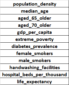
Below we have the table with 44 selected countries (more than 9mln inhabitants) and the Outcome (Deaths per Million) versus the level of factors given (accumulated until June 15th). That is the basis for our DOE testing.
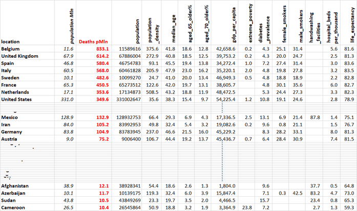
In the table, we see some gaps in data available, especially on hand-washing facilities. Other factors might be out there too that are not so obvious or much harder to get any values for. One could be the level of immigrant workers as we have seen cases that immigrants working in farms, meat-factories or housed together are frequently infected. We'll keep in mind other factors might have been missed when looking at the results.

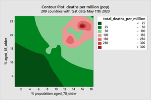
Obviously, we can see that if you have a highly aged population (D & C) these are significantly adding to the mortality rate. Also, GDP per capita (E) is contributing significantly while you might have expected population density (A) too but it is not. Again other factors (including hand-washing facilities) are not included. Note too there is no interaction between factors given while lockdown and other countermeasures might be!?.
In our analogy with business, we usually see that few factors play a significant part (usually 2) than in this complex pandemic 'experiment'. In both cases, though the factors found are not surprising. This is also not the main aim. Eventually, we will need to find the operating range for those significant factors to control the outcome. In the case of Covid-19, this is foremost protecting the elderly from catching the virus. To illustrate this here is an example:
In my personal first DOE back in 1993 when I was graduating at a factory of Philips we found that the yield of a product made in an oven was only influenced by 2 factors i.e. the temperature and the speed of the conveyor going through. Humidity, air-pressure and other factors, provided by the experts internally, were not significant at all. With the DOE results, we could also semi-fix the range of the temperature and speed so that yield could be improved from 70 to above 90% . Controlling was done in real-time by the operators within these ranges indicated next to these 2 knobs. We have even glued down other knobs on the oven to avoid going out of control in other ways!
@DOBILO we help companies to use various data-sources at hand and drill down to the tiniest detail to understand together what is really happening and find the key drivers and operating ranges to steer towards the desired success. Let us help you digging for that kind of GOLD.
To conclude our 3 episodes of this analogy here is an afterthought on Covid-19 for the experts to consider:
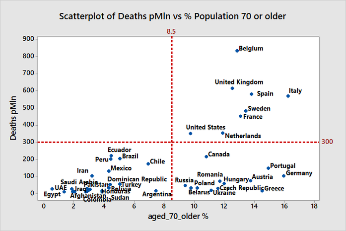
If we zoom into which countries are showing high death rates versus the ageing of the population we see this pattern with 4 obvious quadrants....